B2B SaaS Design System
One shared UI language for four product teams
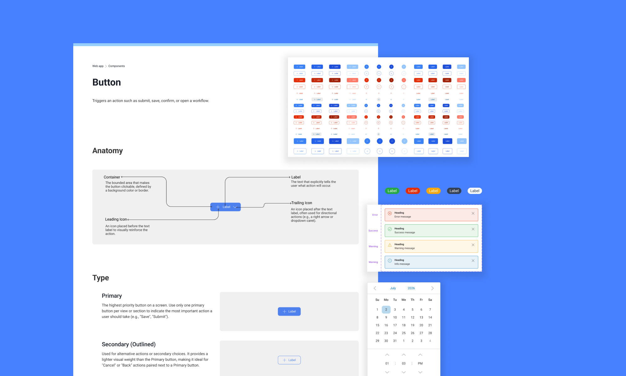
Where we started
There was no design system. Four teams were building the same kinds of components, but each one used different styles, names, and behavior. Designers repeated work, developers received mixed signals, and even a conversation about “the primary button” could mean four different things.
My first challenge was finding out what we actually had. I compared the teams' files component by component and style by style. Some differences were useful because the products had different needs. Others were simply inconsistencies. Telling the two apart took most of the thinking.
The difficult part wasn't making everything the same. It was deciding what should be the same.
What I was responsible for
I worked as part of a design team. My part focused on the structure of the library: variables, components, styles, naming conventions, and documentation. I also spent a lot of time checking how those decisions behaved in real screens, not only inside an isolated component set.
- 01
Audit
Collect what each team was already using.
- 02
Map
Compare patterns, states, and real product needs.
- 03
Name
Create language that design and engineering could share.
- 04
Build
Turn agreed patterns into variables and components.
- 05
Document
Explain how and when the system should be used.
Making one change update the whole system
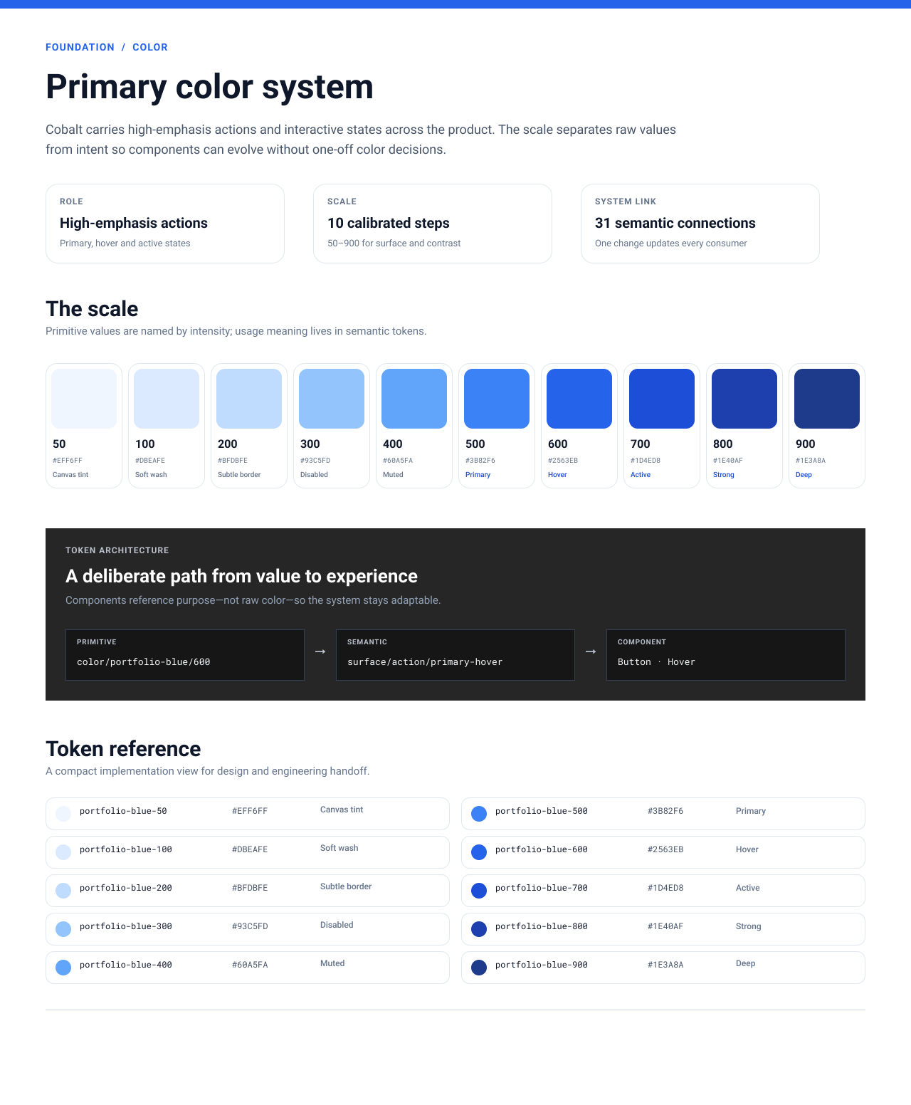
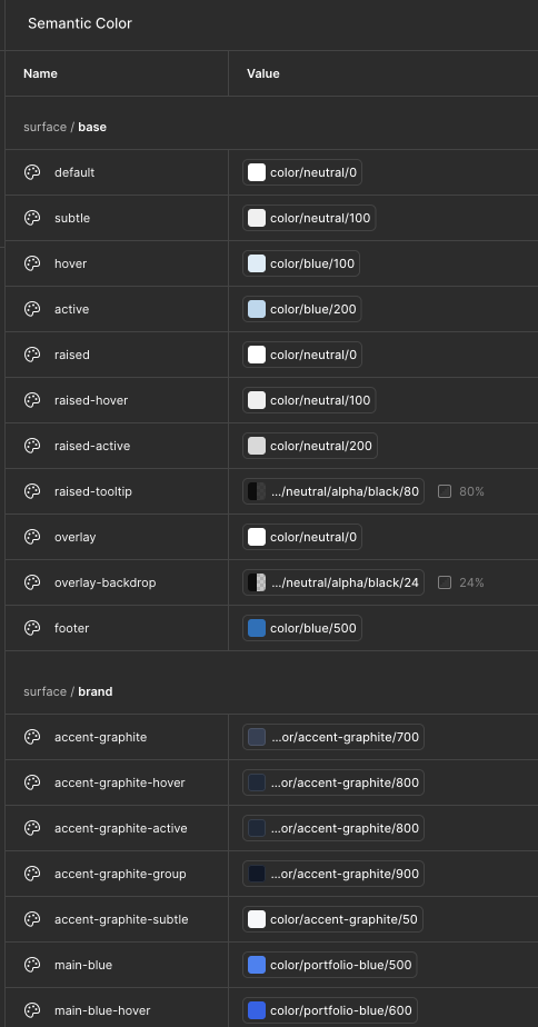
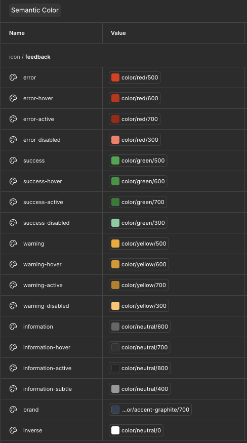
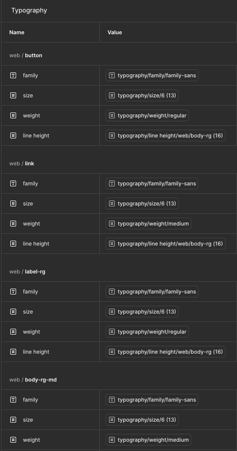
We had hard-coded values and several names for the same thing. I organized the foundations into primitives and semantic variables. The primitives store the raw value; the semantic layer explains how that value is used.
Creating a color scale was the easy part. The harder part was deciding what a token should mean and what people would expect from its name. I used names based on purpose, role, and state so designers and developers could discuss the same decision.
Components that were flexible—but not endless
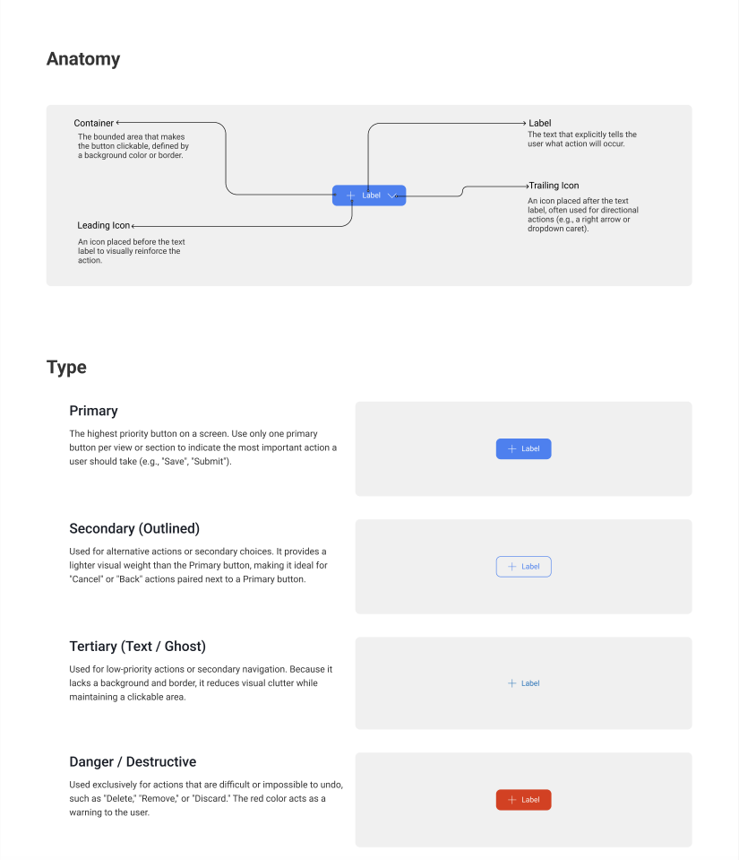
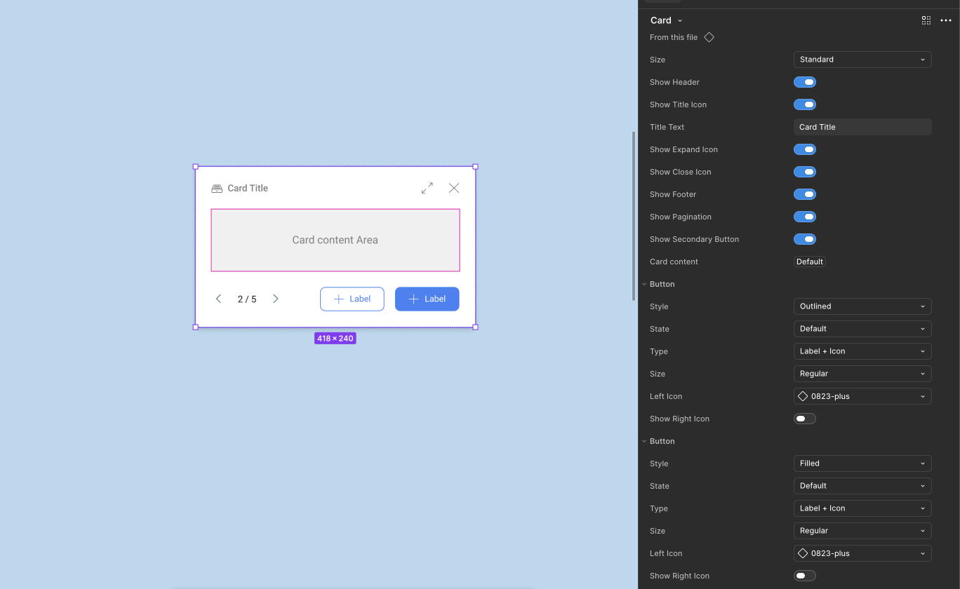
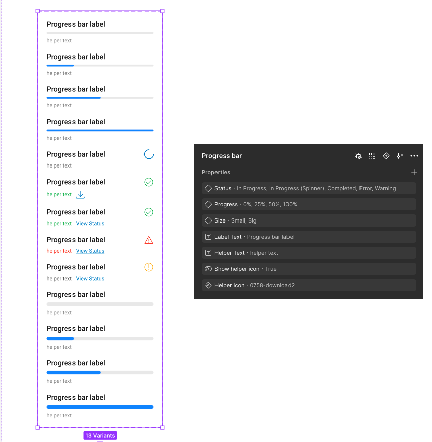
Each team needed slightly different versions of common components. If I removed too many options, designers would detach the component. If I exposed every possible option, the component became difficult to use. I built the properties around choices that appeared in real product work.
I wanted a designer opening the library to understand a component without having to ask its author. The documentation covered anatomy, hierarchy, states, and when to use each type.
Checking the system against a real workflow
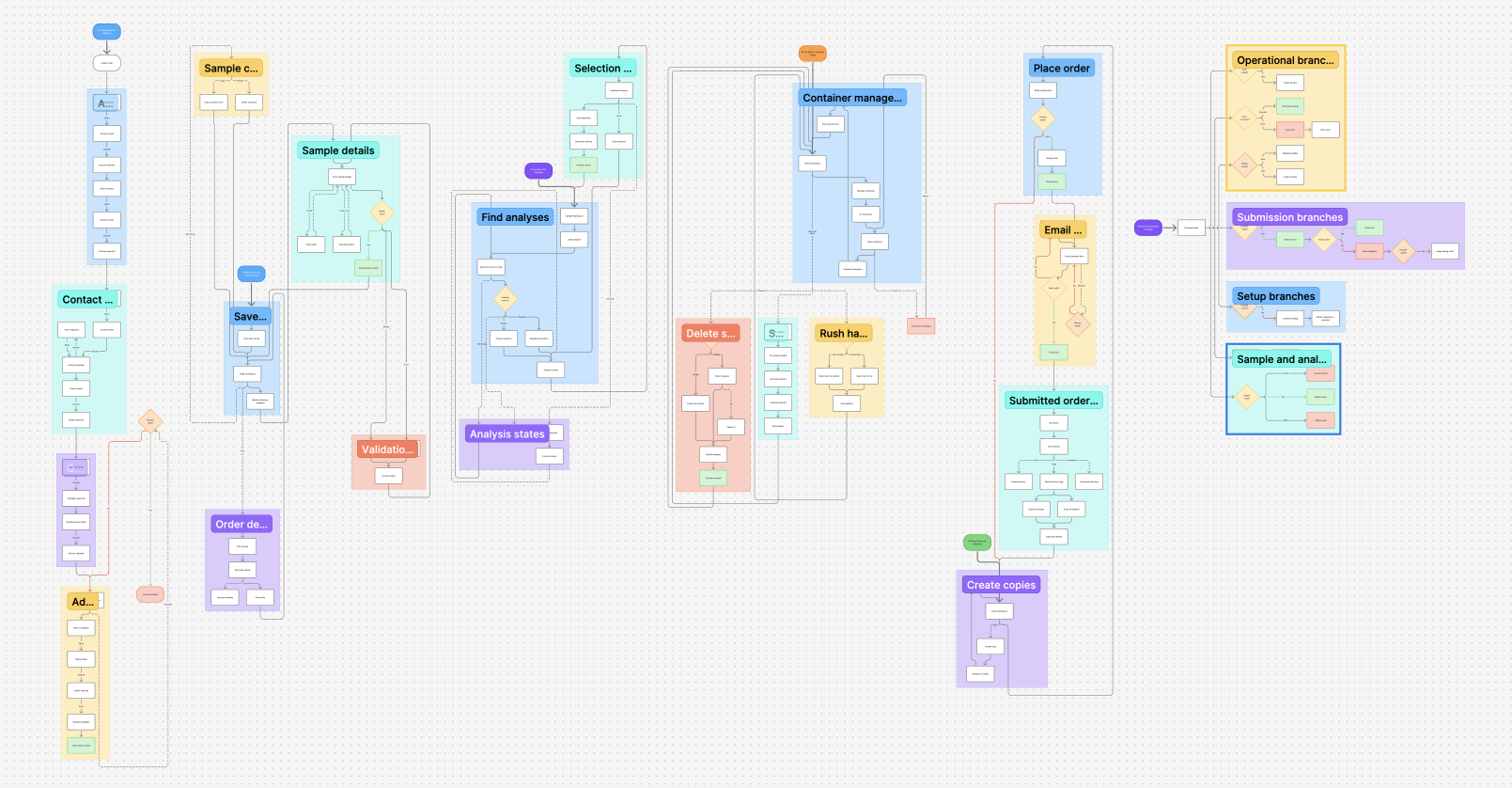
Building components in isolation can hide what is missing. I mapped the end-to-end order flow and used it to check decisions, validation, offline behavior, recovery, and actions after submission. The map helped me see which states belonged in the system and which were specific to one screen.
What changed
By the end of the three months, the teams had one place to look for foundations, components, and usage guidance. We did not have formal adoption or delivery metrics, so I would rather be precise about what changed than invent a percentage.
One place to start
Designers could begin with the same foundations instead of four separate team libraries.
Fewer repeated decisions
Common patterns no longer had to be redesigned from scratch in every file.
A shared vocabulary
Variable and component names gave design and engineering the same words for the same decisions.
More predictable UI
Documented states made interactions more consistent across products.
What I learned
I went into the project thinking the difficult part would be building the library. It wasn't. The difficult part was listening to four teams, understanding why their components had diverged, and deciding where standardization would help rather than get in the way.
I also learned that naming and documentation are UX work. A well-structured component is not useful if people cannot find it, understand it, or predict what changing a property will do.
What I would add next
I would track adoption and component detachment from week one, establish a contribution model, and pair each component with clearer accessibility and usage guidance.
Some client and product details have been generalized or removed for confidentiality.